Flutter Dropdown Button
A highly customizable Flutter dropdown widget with overlay-based rendering and smart positioning


Overview
Flutter Dropdown Button is a dropdown widget package that delivers fine-grained customization and overlay-based rendering beyond what Flutter's built-in DropdownButton can offer. A single unified FlutterDropdownButton<T> widget covers both custom widget rendering and text-only mode, with smart positioning that automatically adjusts the opening direction based on available screen space.
Key Features
- Single Unified Widget: One
FlutterDropdownButton<T>for custom widget mode and text-only mode (.text()) - Overlay-based Rendering: Precise positioning and visual effects via
OverlayEntry - Smart Positioning: Automatically opens upward when insufficient space below
- Independent Menu Width: Set menu width separately from button with alignment options (left/center/right)
- Smart Tooltip: Automatic tooltip on text overflow with full customization
- Custom Scrollbar: Fine-grained scrollbar theming for colors, thickness, and visibility
- Single-Item Mode: Auto-disable when only one option exists
- Smooth Animations: Scale and fade effects with configurable timing
Screenshots
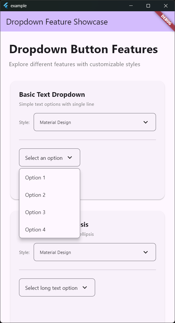 | 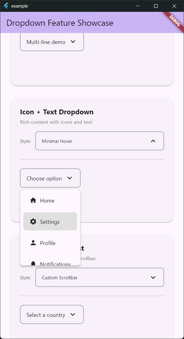 |
| Basic Text Dropdown | Icon + Text Dropdown with Hover |
Supported Platforms
Works on all Flutter-supported platforms: Android, iOS, Web, macOS, Windows, Linux.
Technical Highlights
- OverlayEntry-based Architecture: Unlike Flutter's built-in
DropdownButtonwhich pushes a new Route viaNavigator, this package directly usesOverlayEntry. This enables precise dropdown placement right below/above the button and full control over animations. - Smart Positioning Algorithm: The
calculateDropdownPosition()method calculates available space above and below, dynamically determining the optimal opening direction and height. It even accounts for safe areas (status bar, navigation bar). - DropdownMixin Pattern: Common logic (position calculation, animation management, overlay lifecycle, outside-tap detection) is extracted into a Mixin, eliminating code duplication.
- Three-layer Theme System:
DropdownStyleThemebundlesDropdownTheme(general styling),DropdownScrollTheme(scrollbar), andDropdownTooltipTheme(tooltip) for consistent styling. - Zero External Dependencies: Uses only the Flutter SDK with no third-party packages.
Why It Stands Out
Flutter's built-in DropdownButton has significant customization limitations. It's difficult to finely control overlay positioning, and features like per-item styling or independent menu width settings are simply absent. flutter_dropdown_button addresses these common real-world pain points while being implemented with zero external dependencies — just the Flutter SDK. The unified API through a single widget (FlutterDropdownButton<T>) reduces the learning curve while flexibly handling everything from custom widget rendering to text-only mode.